Data Visualization with chartify
Chartify package
The Chartify package has been created by Spotify, so it seems rude not to make use of it in our project :)
There are several popular Python data visualization packages, of which one is Bokeh.
Chartify is built on top of Bokeh, simplifying the creation of certain types of charts while retaining the ability to modify the underlying Bokeh Figure object.
Take a look at the GitHub repo for more information and examples.
Example repl
Let's take a look at an example which makes use of our Spotify data. Fork the repl, remembering as always to create your own .env file should you wish to re-run the code.
Things should look familiar, until we get to:
tidy = tidy_data(recs)
We'll take a look at tidy.py to see what this function is doing.
Tidying data
One of the most important requirements for data visualization is to ensure our our data is suitably structured.
Tidy data is described here as follows:
Each variable is a column, each observation is a row, and each type of observational unit is a table.
Beyond being tidy, we may also need to apply certain transformations to our datasets, such as stacking or pivoting, so it can be used with our visualization tools of choice.
set_index()
df = pd.DataFrame(tracks_data)
track_numbers = list(range(1, len(df) + 1))
df['Track'] = track_numbers
df = df.set_index('Track')
df.head(2)
| album | artists | available_markets | disc_number | duration_ms | explicit | external_ids | external_urls | href | id | ... | mode | speechiness | acousticness | instrumentalness | liveness | valence | tempo | track_href | analysis_url | time_signature | |
|---|---|---|---|---|---|---|---|---|---|---|---|---|---|---|---|---|---|---|---|---|---|
| Track | |||||||||||||||||||||
| 1 | {'album_type': 'ALBUM', 'artists': [{'external... | [{'external_urls': {'spotify': 'https://open.s... | [AD, AE, AL, AR, AT, AU, BA, BE, BG, BH, BO, B... | 1 | 272946 | False | {'isrc': 'GBBLK0300012'} | {'spotify': 'https://open.spotify.com/track/6S... | https://api.spotify.com/v1/tracks/6SXy02aTZU3y... | 6SXy02aTZU3ysoGUixYCz0 | ... | 0 | 0.0361 | 0.2170 | 0.000458 | 0.334 | 0.571 | 80.897 | https://api.spotify.com/v1/tracks/6SXy02aTZU3y... | https://api.spotify.com/v1/audio-analysis/6SXy... | 4 |
| 2 | {'album_type': 'ALBUM', 'artists': [{'external... | [{'external_urls': {'spotify': 'https://open.s... | [AD, AE, AL, AR, AT, AU, BA, BE, BG, BH, BO, B... | 1 | 199066 | False | {'isrc': 'GBBRL9691749'} | {'spotify': 'https://open.spotify.com/track/5b... | https://api.spotify.com/v1/tracks/5beiMMlsINDI... | 5beiMMlsINDI5fxRdF0D42 | ... | 0 | 0.0270 | 0.0123 | 0.000000 | 0.155 | 0.677 | 108.030 | https://api.spotify.com/v1/tracks/5beiMMlsINDI... | https://api.spotify.com/v1/audio-analysis/5bei... | 4 |
2 rows × 34 columns
- we create a DataFrame from
tracks_data(which is a list of dictionaries) - we add a
Trackcolumn which, if there are six tracks, is simply numbers from 1-6 - we set these values as the DataFrame
index
.copy()
cols = ['popularity', 'danceability', 'energy', 'loudness', 'valence', 'tempo']

stats = df[cols]
stats.head(2)
| popularity | danceability | energy | loudness | valence | tempo | |
|---|---|---|---|---|---|---|
| Track | ||||||
| 1 | 65 | 0.495 | 0.653 | -6.769 | 0.571 | 80.897 |
| 2 | 47 | 0.654 | 0.773 | -6.484 | 0.677 | 108.030 |
- we've created a subset of the original data, containing only that which is needed for our chart
Relative values
df3 = stats / stats.mean()
df3.head(2)
| popularity | danceability | energy | loudness | valence | tempo | |
|---|---|---|---|---|---|---|
| Track | ||||||
| 1 | 1.164179 | 0.947368 | 0.794082 | 1.103731 | 0.783444 | 0.635385 |
| 2 | 0.841791 | 1.251675 | 0.940008 | 1.057260 | 0.928882 | 0.848494 |
- here we have divided the values in each column by the
.mean()of each column - our values are now all relative rather than absolute
This will allow us to more easily compare the values between tracks of each metric using the same chart configuration.
.stack()
df4 = df3.stack().to_frame().reset_index()
df4.columns=['Track', 'Feature', 'Value']
df4.head(3)
| Track | Feature | Value | |
|---|---|---|---|
| 0 | 1 | popularity | 1.164179 |
| 1 | 1 | danceability | 0.947368 |
| 2 | 1 | energy | 0.794082 |
.stack() and its sister .unstack() can be very useful for transforming DataFrames into the appropriate format for a given chart type.
For bar plots, Chartify will want us to specify categorical_columns and numeric_column, so we need to have a row for each data point, with the categorical data (in our case Features) to be a value in each row.
Creating a chart
feature = 'tempo'
ch = chartify.Chart(x_axis_type='categorical')
- we've set the
featurevariable to'tempo'(we'll be able to modify this to any other value found in theFeaturecolumn of thetidyDataFrame) - we've instantiated a
chartify.Chart()object with the given argument forx_axis_type
There are various examples of Chartify code on GitHub.
ch.plot.bar(
    data_frame=tidy[tidy['Feature'] == feature],
    ...
- we will use the
.plot.bar()method of ourchartify.Chart()object - our
data_frameis a subset of thetidyDataFrame, containing only rows with the givenfeature
categorical_columns='Track',
numeric_column='Value',
categorical_order_by='labels',
categorical_order_ascending=True)
- our
categorical_columns(which we set before as being thex_axis_type) will be justTrack - the
numeric_columnwill therefore be represented on they_axis - the
categorical_order...parameters will determine the order of thex_axis
Refer to the examples and documentation for more detail on these methods and parameters.
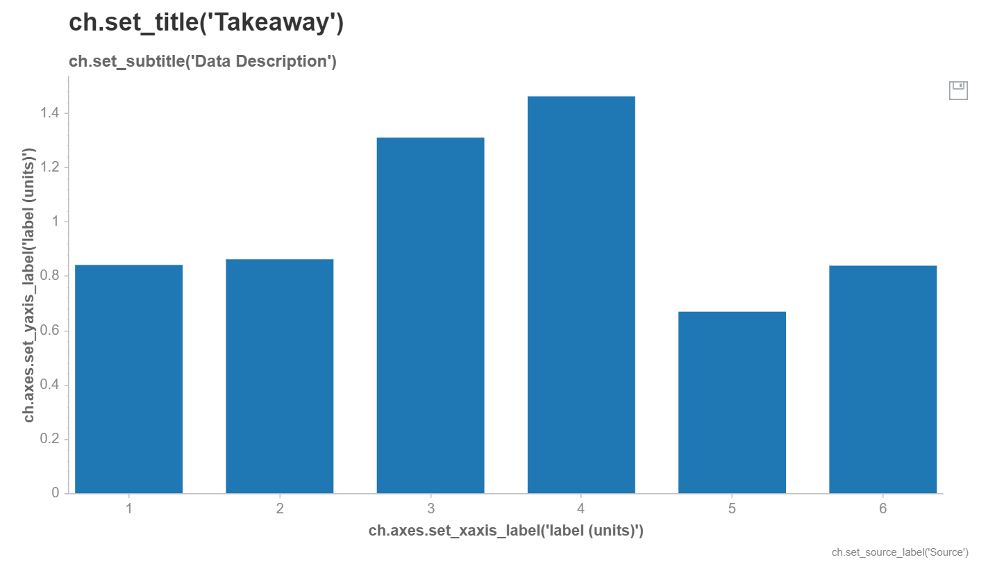
Our data has been plotted on a bar chart, with some helpful placeholders for various label and title attributes which we can change.
Modifying chart attributes
ch.set_title(f"Track comparison by {feature}")
ch.set_subtitle(None)
ch.set_source_label('Data source: Spotify')
ch.axes.set_xaxis_label('Track')
ch.axes.set_yaxis_label('Value')
chartify.Chart(blank_labels=False,
layout='slide_100%',
x_axis_type='categorical',
y_axis_type='linear')
- we can set the various chart attributes as required (or remove them using
None) - plots can be further customized; refer to the documentation
Saving charts
filename = f'charts/{feature}.png'
ch.save(filename, format='png')
- the
.save()method allows us to save the chart in various formats svg,pngandhtmlcan be used for theformatparameter
In the Seeder app, the svg format has been used, which scales better than png (without loss of image quality). The html format may be useful if you want to incorporate interactivity into your charts.